Two Colour Combination for Dining Room. There are only a few locations in the house where you can experiment with a bold colour palette. One of those select places in the dining room. It can manage something a bit more dramatic, a little more imaginative, and a little more ambitious if it is frequented but not for lengthy periods of time.
Two Colour Combination for Dining Room
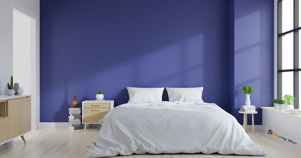
Designers’ dining room colour choices are a never-ending source of inspiration. Explore some of our favourite dining room colour schemes right now. Explore our tips for Living Room Color Schemes and Bedroom Color Schemes for ideas on other rooms.
1. Silver And Gold (Two Colour Combination for Dining Room)
This Katharine Pooley-designed dining room colour scheme is the interior equivalent of a jewellery box filled with gleaming precious metals and pearls, thanks to a brilliant mix of gold, silver, and white tones. The use of white walls and mouldings beautifully enhances the area, tying in the early spring beauty of the cherry blossom wallpapers and modernising the ornamental ceiling motifs. A lovely chandelier hangs overhead, giving the room a light and airy feel.

2. Neutral And Green (Two Colour Combination for Dining Room)
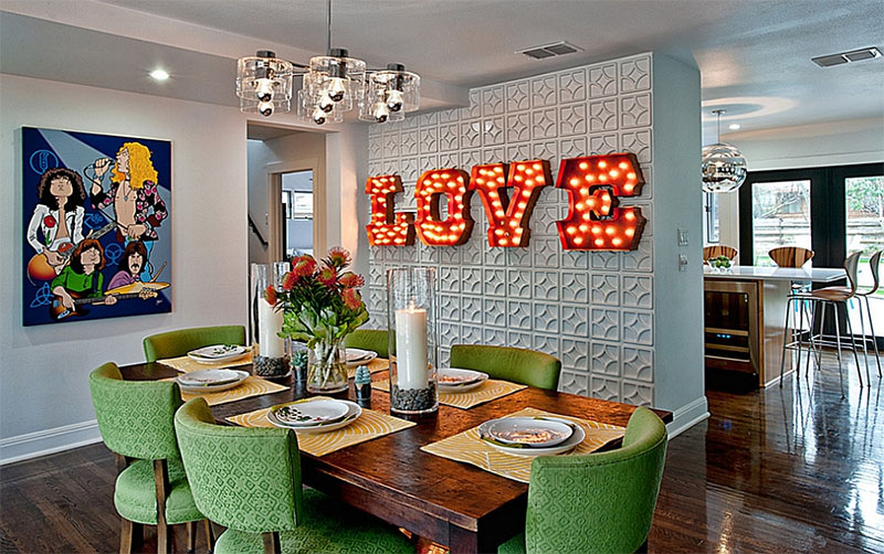
The Helen Green-designed dining room mixes ginger-hued parquet flooring and medium wood colours of its dining table and sideboard with an equally evocative yet relaxing natural dining room colour scheme. The buffet table lamps are a deep green pulled from a colourful canvas, and the area is brightened with creamy klismos-backed dining room chairs. Deep brass hardware and a dark grey wallpaper lend a luxurious touch.
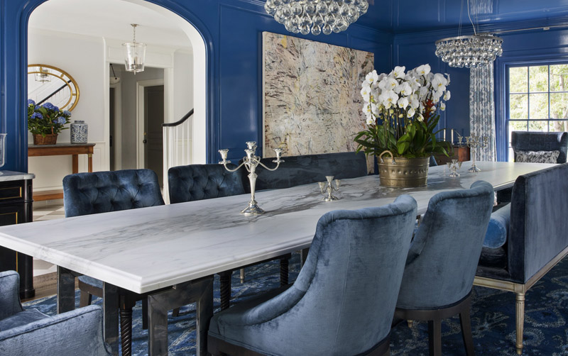
3. Blue And Neutral Dining Room
This Helen Green dining room colour palette gives a sophisticated twist to a classic colour pair by reviving shades of powdered blues and inviting neutrals to produce a timeless dining room colour plan that is both calm and elegant. Deep neutral curtains frame the windows, while the doors and dining table are made of even deeper woods.
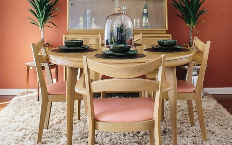
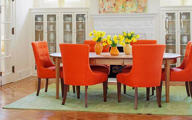
4. Coral And Neutral Dining Room
Designers that use warm and cold tones together in innovative ways pique our interest. A rich grey wallpaper is countered by golden brass tones and harmonised with mild pink draperies and neutral furniture in this dining room colour scheme. The textures are minimal, but the wavy glass panes of the one-of-a-kind chandelier, as well as the visually textured carpet and Hermes-patterned roman blinds, add just enough.
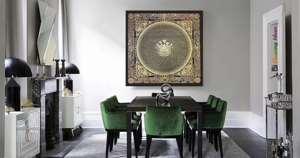
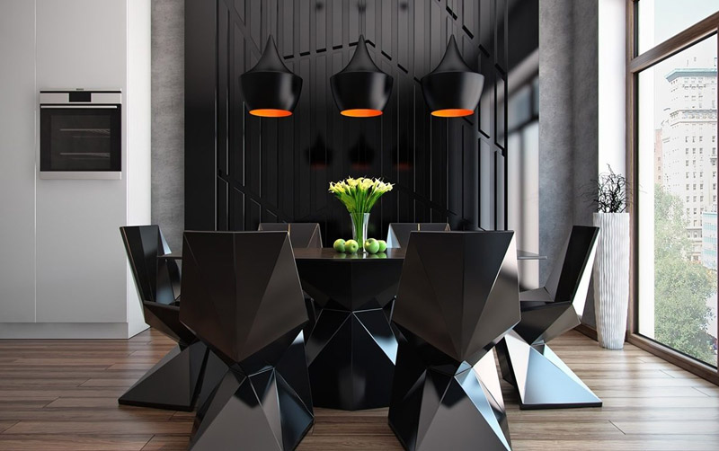
5. Black Dining Room
Black is not anything to be afraid of, especially when it comes to dining room colour schemes. Dining rooms, in fact, benefit from a black colour palette more than any other room. Its passion and intimacy are both excellent moods for dinner parties, and its use in a rarely used room makes it completely liveable.
Jessie D. Miller expertly balances the contrast by combining semi-gloss black wall panelling with such a jute-like neutral false ceiling and neutral stone flooring. Modern Platner dining chairs that surround a high-gloss dining table are a strategic choice that provides the desired visual lightness that such an aggressive dining room colour palette requires.
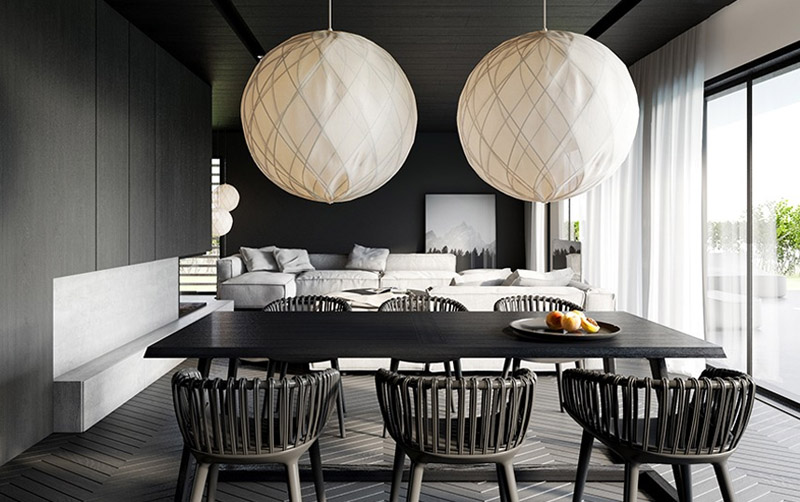
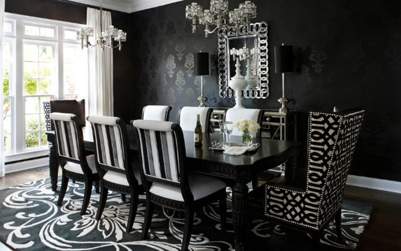
6. Monochrome Dining Room
Monochrome never goes out of style, and as this classy dining room colour palette of charcoal, white, black, and silver demonstrates, it’s one of the greatest choices for a sophisticated and delicately layered palette.
Jennifer Post, a New York-based interior designer, works double work in this dining room, with two nearly identical table setups. Jiun Ho’s bronze-based dining tables with a blackened patina anchor each space, which is encircled by cut-out back chairs and capped with Sciolari-inspired lights.
7. Black And Grey Dining Room (Two Colour Combination for Dining Room)
A gloomy dining room colour palette can be as attractive as a lighter dining room colour palette (if not more so for those atmospheric evening dinner gatherings), and it can be applied successfully with a few clever design adjustments.
A Yabu Pushelberg dining room contrasts matte black wall panelling with a high-gloss black dining table, visually recognising the shifting properties of colour when utilised in different finishes. The use of high polish (and a gleaming chandelier) helps keep the area from feeling weighty – instead, the arrangement appears clever and professional. The seats take on a lighter grey from a nearby Chinese design-inspired artwork, which also incorporates flecks of green for an organic touch.
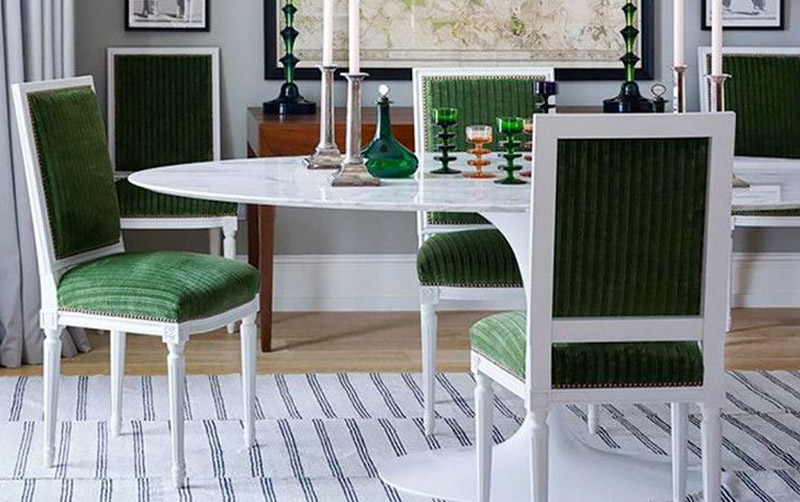
8. Green And Neutral (Two Colour Combination for Dining Room)
In this ultra-modern riverside apartment, Dariel Studio combines a lush green and neutral dining room colour palette. Offsetting the space’s harsh lines and contemporary designs, the colour palette produces an extremely welcome and homely feeling in just such a modern location.
9. Turquoise And Orange Dining
The world’s most opulent hotel restaurants have some of the most unusual dining room colour schemes. The contrast of burnt orange and turquoise in the Langham Ningbo’s Ming Court demonstrates that conflicting colour palettes may be exquisite, with the fireplace’s patinated metallic surface standing in contrast to the beautiful turquoise hand-painted wallpaper. The use of monochrome chairs inspired by ancient klismos keeps the appearance from becoming too dynamic, preserving the sophisticated ambience.
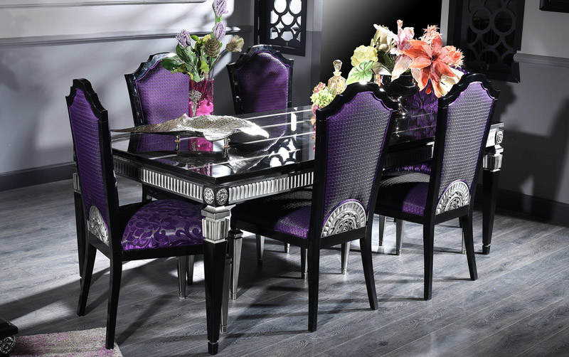
10. Purple Dining Room
Rich rich purples make this Taylor Howes dining room colour palette into a lavish atmosphere ideal for a magnificent feast.
According to Helena Bell, Director at Taylor Howes, “the aubergine dining room colour scheme at [One Kensington Gardens] was a big success.” The highly textured dark purple wall covering serves as an ideal backdrop for the crystal pendant, which appears to float above the glossy lacquered wood table. Glamour and opulence are created by a plethora of polished and reflecting materials.
Because the dining room was not intended for everyday usage, it was critical that the customers could impress their visitors and give an impressive talking point for costly dinner parties, and this dining room colour achieved just that. This dining room was all about establishing a boldly dramatic focal point within an otherwise airy and large apartment that visitors and owners alike will continue to speak about for years to come.”
The addition of a modern silver rug, an attractive table arrangement, and fitted lines softens the regal tones (the Art Deco-inspired table is a dining classic; get the look here).
10 Tips for Picking Paint Colours
- Start Small
- Think About Your Mood
- Pay Attention to Lighting
- Learn the Color Terms
- Test Your Color Choice
- Add Depth With Decorative Finishes
- Walk Into Another Room
- Follow the Color Wheel
- Play Up Monochromatic Schemes
- Choose Different Paint Finishes